We may earn money or products from the companies mentioned in this post.
 There are many different ways to build a website. From WordPress over Joomla, Drupal and website builders to pure HTML and tools like Dreamweaver. In short, if you need a website, you can find a method to create it and in this bootstrap tutorial for beginners, you will learn one more.
Bootstrap is a front-end framework that helps you build mobile responsive websites more quickly and easily. First developed by Twitter, Bootstrap is by now used for anything from developing web applications to WordPress themes. It is also completely free, versatile and intuitive.
Enough reason for us to write up a detailed Bootstrap tutorial that teaches you everything you need to know. In the following, you will learn what Bootstrap is, how to set it up and build a simple landing page for a website step by step. In the end, we want you to have a basic understanding of how to use Bootstrap so you can continue learning by yourself.
Bootstrap Tutorial Step #1: What is Bootstrap?
The first part of every Bootstrap beginner tutorial needs to talk about what Bootstrap even is. Only if you know what you are dealing with, can you start to understand how to use it.

An Open Source Project
As you already know, Bootstrap was originally created by Twitter. A small group of developers in the company put it together as an internal tool to help create consistent web interfaces. The project kept growing until at last they decided to release it to the public for free usage in 2011.
Since then, support for Bootstrap has continued both by a number of the original developers as well as a large group of contributors. It has seen several major updates over the years (the last one, Bootstrap 4, in January 2018) that have, among other things, added its famous grid system, flat design, a mobile-first approach and modern CSS.
By now, the framework is among the most popular web development tools on the net. Among other things, it has become the second-most starred project on Github. However, what exactly does it do?
A Front-end Framework
As mentioned in the introduction, Bootstrap is a framework for front-end development. Don’t worry if you don’t know what that means, I didn’t either when I started putting together this post.
In computer programming, a framework is sort of like a library. It contains tools, parts and existing functionality that you can use to accomplish standard tasks quicker and easier. In the case of Bootstrap, these standard tasks are creating design patterns like forms, menus, columns, buttons and other components you frequently need for websites.
Bootstrap helps you set them up by offering a large number of CSS classes you can easily apply to HTML elements to create the site components you need. That way, you can conjure complex web pages from standard HTML and customize them to your needs. In addition to that, Bootstrap comes with a number of jQuery plugins that can provide additional functionality such as carousels, buttons, tooltips and more.
If you are still not sure about how this helps you, don’t worry, the examples below will make it clear. The important thing to remember is that Bootstrap gives you a lot of shortcuts for creating web pages that will save you time and energy. All you need is a basic understanding of HTML and CSS to creates that are responsive, mobile first and compatible with all modern browsers.
All clear so far? Then let’s see how exactly it works.
Bootstrap Tutorial Step #2: Setup and Overview
In order to use Bootstrap, you first need to integrate it into your development environment aka web page. For that, you have two different possibilities: load it remotely or download and use Bootstrap locally. However, for both, you first need something to load it into.
1. Create an HTML Page
As a first step, we will create a simple HTML template as a base where we will use Bootstrap. For that, the first thing you want to do is create a folder on your computer or server for the project files. In this case, I will simply call it bootstrap. Here, create a new text file and call it index.html. Open it with a text editor of your choice (e.g. Notepad++) and then paste the code below into it.
<!DOCTYPE html>
<html lang="en">
<head>

  <title>Bootstrap Tutorial Sample Page</title>
  <meta charset="utf-8">
  <meta name="viewport" content="width=device-width, initial-scale=1">

</head>
<body>


</body>
</html>
Don’t forget to save your file before moving on!
2a. Load Bootstrap via CDN
As already explained, Bootstrap consists mainly of style sheets and scripts. As such, they can be loaded in the header and footer of your web page like other assets such as custom fonts. The framework offers a CDN (content delivery network) access path for that. You can find it on the Bootstrap download page, further below.
To get Bootstrap into your page, simply paste the code below into the <head> section of your template.
<link rel="stylesheet" href="https://stackpath.bootstrapcdn.com/bootstrap/4.1.3/css/bootstrap.min.css" integrity="sha384-MCw98/SFnGE8fJT3GXwEOngsV7Zt27NXFoaoApmYm81iuXoPkFOJwJ8ERdknLPMO" crossorigin="anonymous">
When you now save the file, any browser that opens it will automatically load the Bootstrap assets.
Using the remote method is a good idea as many users will already have the framework in the cache of their browser. If that is the case, they won’t have to reload it when coming to your site, leading to faster page loading time. As a consequence, this is the recommended method for live sites.
However, for experimenting and development, or if you want to be independent of an Internet connection, you can also get your own copy of Bootstrap. This is what I am doing for this tutorial because it also results in less code to post.
2b. Host Bootstrap Locally
An alternative way to set up Bootstrap is to download it to your hard drive and use the files locally. You find download options in the same place as the links to the remote version. Here, be sure to get the compiled CSS and JS files. You don’t need the source files.
Once you have done so, unzip the file and copy its contents into the same directory as index.html. After that, you can load the Bootstrap CSS into your project like this:
<link rel="stylesheet" href="bootstrap/css/bootstrap.min.css">
You will notice that this includes the file path at which to find the Bootstrap file. In your case, make sure your path corresponds to your actual setup. For example, the names of the directories might differ if you downloaded a different version of Bootstrap.
3. Include jQuery
In order to get the full functionality of Bootstrap, you need to also load the jQuery library. Here, too, you have to possibility to load it remotely or host it locally.
In the first case, you find the link to latest version of jQuery here. You can use it to load the library into your page by putting the line of code below right before where it says </body> in your page.
<script src="https://code.jquery.com/jquery-3.3.1.slim.min.js" integrity="sha384-q8i/X+965DzO0rT7abK41JStQIAqVgRVzpbzo5smXKp4YfRvH+8abtTE1Pi6jizo" crossorigin="anonymous"></script>
Alternatively, download jQuery, unzip and put it into the project folder. Then, include it in the same place of your file in this way:
<script src="jquery-3.3.1.min.js"></script>
Again, make sure the path corresponds to your setup.
4. Load Bootstrap JavaScript
The last step in setting up Bootstrap is to load the Bootstrap JavaScript library. These are included in the downloaded version of the framework and you also find links to remote sources in the same place as before. However, we will load it in a different place than the style sheet. Instead of the header, it goes into the page footer, right after the call for jQuery.
You can call it remotely like this:
<script src="https://stackpath.bootstrapcdn.com/bootstrap/4.1.3/js/bootstrap.min.js" integrity="sha384-ChfqqxuZUCnJSK3+MXmPNIyE6ZbWh2IMqE241rYiqJxyMiZ6OW/JmZQ5stwEULTy" crossorigin="anonymous"></script>
Or locally like so:
<script src="bootstrap/js/bootstrap.min.js"></script>
5. Putting it All Together
If you have followed the steps above correctly, you should end up with a file that looks like this for the remote solution:
<!DOCTYPE html>
<html lang="en">
  <head>

    <title>Bootstrap Tutorial Sample Page</title>
    <meta charset="utf-8">
    <meta name="viewport" content="width=device-width, initial-scale=1">
    <link rel="stylesheet" href="https://stackpath.bootstrapcdn.com/bootstrap/4.1.3/css/bootstrap.min.css" integrity="sha384-MCw98/SFnGE8fJT3GXwEOngsV7Zt27NXFoaoApmYm81iuXoPkFOJwJ8ERdknLPMO" crossorigin="anonymous">

  </head>
<body>

<script src="https://code.jquery.com/jquery-3.3.1.slim.min.js" integrity="sha384-q8i/X+965DzO0rT7abK41JStQIAqVgRVzpbzo5smXKp4YfRvH+8abtTE1Pi6jizo" crossorigin="anonymous"></script>
<script src="https://stackpath.bootstrapcdn.com/bootstrap/4.1.3/js/bootstrap.min.js" integrity="sha384-ChfqqxuZUCnJSK3+MXmPNIyE6ZbWh2IMqE241rYiqJxyMiZ6OW/JmZQ5stwEULTy" crossorigin="anonymous"></script>
</body>
</html>
Alternatively, if you are hosting locally, your page template should resemble the code below:
<!DOCTYPE html>
<html lang="en">
  <head>

    <title>Bootstrap Tutorial Sample Page</title>
    <meta charset="utf-8">
    <meta name="viewport" content="width=device-width, initial-scale=1">
    <link rel="stylesheet" href="bootstrap/css/bootstrap.min.css">

  </head>
<body>


<script src="jquery-3.3.1.min.js"></script>
<script src="bootstrap/js/bootstrap.min.js"></script>
</body>
</html>
If that is what you have and you saved your work, you are now ready to move on to the next step.
Bootstrap Tutorial Step #3: Design Your Landing Page
Alright, that was, admittedly, a lot of preparation work. However, it wasn’t very hard, was it? Plus, now the fun begins.
At the moment, when you navigate to your sample site, you should simply see a blank page. Time to change that.
1. Add a Navigation Bar
The first thing we want to do is add a navigation bar to the top of the page. This allows your visitors to get around your site and discover the rest of your pages.
For that, we will use the navbar class. This is one of the default elements of Bootstrap. It creates a navigation element that is responsive by default and will automatically collapse on smaller screens. It also offers built-in support for adding branding, color schemes, spacing and other components.
We will use it like below and post it just below the <body> tag:
<nav class="navbar navbar-expand-md">
<a class="navbar-brand" href="#">Logo</a>
<button class="navbar-toggler navbar-dark" type="button" data-toggle="collapse" data-target="#main-navigation">
<span class="navbar-toggler-icon"></span>
</button>
<div class="collapse navbar-collapse" id="main-navigation">
<ul class="navbar-nav">
<li class="nav-item">
<a class="nav-link" href="#">Home</a>
</li>
<li class="nav-item">
<a class="nav-link" href="#">About</a>
</li>
<li class="nav-item">
<a class="nav-link" href="#">Contact</a>
</li>
</ul>
</div>
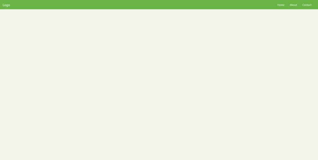
</nav>Some explanation of the code:
navbar-expand-md— This denotes at which point the navigation bar expands from vertical or hamburger icon to a full-size horizontal bar. In this case, we have set it to medium screens, which, in Bootstrap, is anything greater than 768px.navbar-brand— This is used for your website branding. You can also include a logo image file here.navbar-toggler— Denotes the toggle button for the collapsed menu. The piecedata-toggle="collapse"defines that this will turn to a hamburger menu, not to drop-down, which is the other option. It’s important that you define adata-targetwith a CSS id (defined by the#) and wrap adivwith the same name around the actualnavbarelement.navbar-toggler-icon— As you can probably guess, this creates the icon users click on to open the menu on smaller screens.navbar-nav— The class for the<ul>list element that holds the menu items. The latter are denoted withnav-itemandnav-link.
Why am I explaining this so much?
Because that is the point of Bootstrap. You have all of these standards that allow you to quickly create elements with some HTML and CSS classes. You don’t have to write any CSS to provide styling, everything is already set up within Bootstrap. Plus, everything is mobile responsive out of the box! Are you starting to see how helpful this is?
The above is enough to add a navigation bar to your site. However, at the moment, it still looks like very little.

That’s because it doesn’t have a lot of styling attached to it. While you are able to add default colors (for example, by giving the navbar a class like bg-dark navbar-dark), we instead want to add our own.
2. Include Custom CSS
Fortunately, if you want to change the default styling, you don’t have to wade through a large library of style sheets and make the changes by hand. Instead, just like with a WordPress child theme, you are able to add your own CSS files which you can use to overwrite existing styling.
For that, simply create a blank file with your text editor and call it main.css. Save it, then add it to the head section of your Bootstrap site like this:
<link rel="stylesheet" type="text/css" href="main.css">
This is the code for a style sheet that resides in the main directory. If you decide to place your inside the css folder, be sure to include the correct path in the link.
From here, you are able to add custom CSS to your site. For example, to style the navigation bar and its elements, you could use markup like this:
body {
  padding: 0;
  margin: 0;
  background: #f2f6e9;
}

/*--- navigation bar ---*/

.navbar {
  background:#6ab446;
}

.nav-link,
.navbar-brand {
  color: #fff;
  cursor: pointer;
}

.nav-link {
  margin-right: 1em !important;
}

.nav-link:hover {
  color: #000;
}

.navbar-collapse {
  justify-content: flex-end;
}
And here is the result:
Looks better than before, doesn’t it?
3. Create a Page Content Container
After the navigation bar, the next thing you want is a container for the page content. This is really easy in Bootstrap as all you need for it is this underneath the navbar tag:
<header class="page-header header container-fluid">

</header>
Notice the container-fluid class. This is another one of those default Bootstrap classes. Applying it to the div element automatically applies a bunch of CSS to it.
The -fluid part makes sure the container stretches across the entire width of the screen. There’s also just container, which has fixed widths applied to it, so there will always be space on both sides of the screen.
However, if you now reload the page, you still won’t see anything (unless you use the developer tools). That’s because you only created an empty HTML element. This will start changing now.
4. Background Image and Custom JavaScript
As the next step in this Bootstrap tutorial, we want to include a full-screen background image for our landing page header. For that, we will have to use some jQuery to make the image stretch all the way across the screen.
You do that the same way you include custom CSS. First, create a text file of the name main.js and place it inside your site folder. Then, call it before the closing </body> tag inside index.html.
<script src="main.js"></script>
After that, you can copy and paste this piece of code to make the <header> element stretch across the entire screen:
$(document).ready(function(){
  $('.header').height($(window).height());
})
Then, the only thing that’s left is to actually set a background image. You can do this like so inside main.css:
.header {
  background-image: url('images/header-background.jpg');
  background-size: cover;
  background-position: center;
  position: relative;
}
If you place an image of sufficient size at the location specified by the path above, you will achieve a result similar to this:
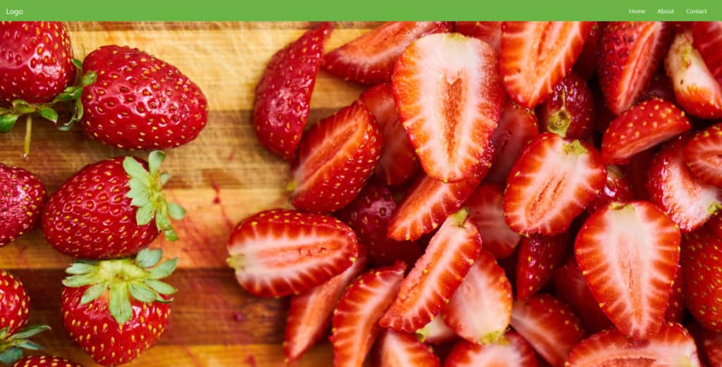
5. Add an Overlay
To make the background image extra stylish, we will also add an overlay. For that, you will create another div element inside the one you just included earlier.
<div class="overlay"></div>
Then, you can add the following in your custom CSS file:
.overlay {
  position: absolute;
  min-height: 100%;
  min-width: 100%;
  left: 0;
  top: 0;
  background: rgba(0, 0, 0, 0.6);
}
This will create this nice overlay for the image you input earlier:

6. Include a Page Title and Body Text
Now you probably want to add a page title in the form of a heading plus some body text. That way, your visitors will know immediately which site they are on and what they can expect from it.
To create those, simply add this snippet inside the container you set up in the last step, below the overlay:
<div class="description">
  <h1>Welcome to the Landing Page!</h1>
  <p>Lorem ipsum dolor sit amet, consectetur adipiscing elit. Quisque interdum quam odio, quis placerat ante luctus eu. Sed aliquet dolor id sapien rutrum, id vulputate quam iaculis. Suspendisse consectetur mi id libero fringilla, in pharetra sem ullamcorper.</p>
</div>
After that, add the following markup to main.css.
.description {
  left: 50%;
  position: absolute;
  top: 45%;
  transform: translate(-50%, -55%);
  text-align: center;
}

.description h1 {
  color: #6ab446;
}

.description p {
  color: #fff;
  font-size: 1.3rem;
  line-height: 1.5;
}
When you do, the landing page now looks like this:

It’s really starting to come together, isn’t it?
7. Create a CTA Button
No landing page is complete without a call to action, most often in the form of a button. For that reason, we would be amiss not to include how to create one in this Bootstrap tutorial.
The framework offers plenty of tools to create buttons quickly and easily. You can find a lot of examples here. In my case, I add the following markup right below the page content inside the <description> container:
<button class="btn btn-outline-secondary btn-lg">Tell Me More!</button>
In addition to that, I add this CSS to main.css:
.description button {
  border:1px solid #6ab446;
  background:#6ab446;
  border-radius: 0;
  color:#fff;
}

.description button:hover {
  border:1px solid #fff;
  background:#fff;
  color:#000;
}
After saving and reloading, it looks like this:

8. Set up a Three-column Section
I am already quite satisfied with how things are shaping up. However, we are not done with the page yet. Next up, we want to create three columns below the main content for additional information. This is a specialty of Bootstrap since it plays to its strength: creating a grid. Here’s how to do that in this case:
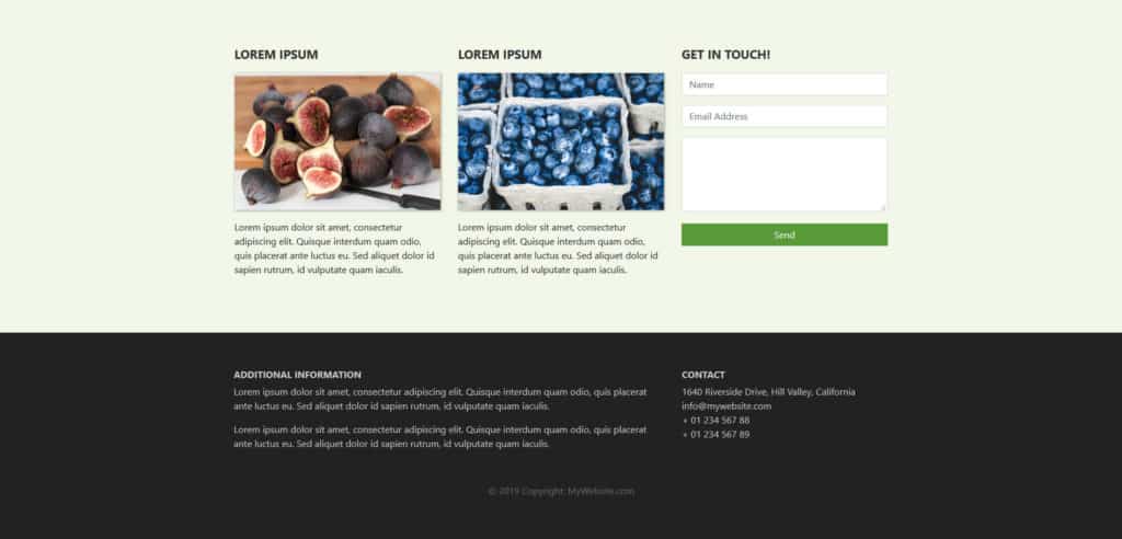
<div class="container features">
  <div class="row">
    <div class="col-lg-4 col-md-4 col-sm-12">
      <h3 class="feature-title">Lorem ipsum</h3>
      <img src="images/column-1.jpg" class="img-fluid">
      <p>Lorem ipsum dolor sit amet, consectetur adipiscing elit. Quisque interdum quam odio, quis placerat ante luctus eu. Sed aliquet dolor id sapien rutrum, id vulputate quam iaculis.</p>
    </div>
    <div class="col-lg-4 col-md-4 col-sm-12">
      <h3 class="feature-title">Lorem ipsum</h3>
      <img src="images/column-2.jpg" class="img-fluid">
      <p>Lorem ipsum dolor sit amet, consectetur adipiscing elit. Quisque interdum quam odio, quis placerat ante luctus eu. Sed aliquet dolor id sapien rutrum, id vulputate quam iaculis.</p>
    </div>
    <div class="col-lg-4 col-md-4 col-sm-12">
    </div>
  </div>
</div>
The first thing you will notice is the row element. You need this whenever creating columns to act as a container for the grid.
As for the columns, they all have several classes: col-lg-4, col-md-4 and col-sm-12. These denote that we are dealing with columns and the size they will have on different screens.
To understand this, you need to know that in a Bootstrap grid, all columns in one row always add up to the number 12. So, giving them the classes above means that they will take up one third of the screen on large and medium screens (12 divided by 3 is 4) but the entire screen on small devices (12 out of 12 columns).
Makes sense, doesn’t it?
You will also notice that I included images and added the .image-fluid class to them. This is to make them responsive so that they scale along with screen that the page is viewed on.
In addition to that, you have the following styling included in the usual place:
.features {
  margin: 4em auto;
  padding: 1em;
  position: relative;
}

.feature-title {
  color: #333;
  font-size: 1.3rem;
  font-weight: 700;
  margin-bottom: 20px;
  text-transform: uppercase;
}

.features img {
  -webkit-box-shadow: 1px 1px 4px rgba(0, 0, 0, 0.4);
  -moz-box-shadow: 1px 1px 4px rgba(0, 0, 0, 0.4);
  box-shadow: 1px 1px 4px rgba(0, 0, 0, 0.4);
  margin-bottom: 16px;
}
When added below the main content and saved, it looks like this:

9. Add a Contact Form
You will notice that one of the new fields is still empty. This was on purpose because we want to add a contact form to it. This is a very normal practice for landing pages to allow visitors to get in touch.
Creating a contact form in Bootstrap is quite easy:
<h3 class="feature-title">Get in Touch!</h3>
<div class="form-group">
  <input type="text" class="form-control" placeholder="Name" name="">
</div>
<div class="form-group">
  <input type="email" class="form-control" placeholder="Email Address" name="email">
</div>
<div class="form-group">
  <textarea class="form-control" rows="4"></textarea>
</div>
<input type="submit" class="btn btn-secondary btn-block" value="Send" name="">
By now, I shouldn’t have to explain the markup to create columns anymore. Here’s what the rest of the markup means:
form-group— Used to wrap around form fields for formatting.form-control— Denotes form fields such as inputs, text areas etc.
There is a lot more you can do with forms, which you can find out in the documentation. However, for demonstration purposes the above is enough. Place it inside the remaining empty column and then add this styling in main.css:
.features .form-control,
.features input {
    border-radius: 0;
}

.features .btn {
  background-color: #589b37;
  border: 1px solid #589b37;
  color: #fff;
  margin-top: 20px;
}

.features .btn:hover {
  background-color: #333;
  border: 1px solid #333;
}
When you do, you get a form like this:

10. Create a Two-column Footer
Alright, we are now getting towards the end of the Bootstrap tutorial. The last thing you want to add to your landing page is a footer section with two columns. By now, this shouldn’t pose much of a problem for you anymore.
<footer class="page-footer">
  <div class="container">
    <div class="row">
      <div class="col-lg-8 col-md-8 col-sm-12">
      <h6 class="text-uppercase font-weight-bold">Additional Information</h6>
      <p>Lorem ipsum dolor sit amet, consectetur adipiscing elit. Quisque interdum quam odio, quis placerat ante luctus eu. Sed aliquet dolor id sapien rutrum, id vulputate quam iaculis.</p>
      <p>Lorem ipsum dolor sit amet, consectetur adipiscing elit. Quisque interdum quam odio, quis placerat ante luctus eu. Sed aliquet dolor id sapien rutrum, id vulputate quam iaculis.</p>
    </div>
    <div class="col-lg-4 col-md-4 col-sm-12">
      <h6 class="text-uppercase font-weight-bold">Contact</h6>
      <p>1640 Riverside Drive, Hill Valley, California
      <br/>info@mywebsite.com
      <br/>+ 01 234 567 88
      <br/>+ 01 234 567 89</p>
    </div>
  </div>
  <div class="footer-copyright text-center">© 2019 Copyright: MyWebsite.com</div>
</footer>
Besides the usual grid markup, this section highlights a few possibilities to modify typography with Bootstrap:
text-uppercasefont-weight-boldtext-center
It should be pretty clear from the names of the classes what they do. You can find more information about Bootstrap and typography here.
In addition to the above, you can use styling like this:
.page-footer {
  background-color: #222;
  color: #ccc;
  padding: 60px 0 30px;
}

.footer-copyright {
  color: #666;
  padding: 40px 0;
}
This results in a beautiful footer that looks like so:
11. Add Media Queries
The page is basically ready by now. It is also fully responsible. However, in the mobile view of the browser, the upper section doesn’t come out quite right yet.
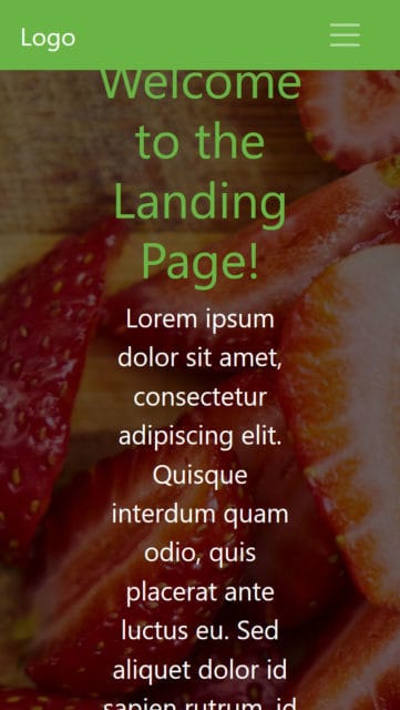
However, no worries, you can correct that quite easily with a simple media query. Unless you are using SASS for compiling your Bootstrap site, these work the same way as in other instances. You just need to keep in mind the preset break points included in Bootstrap.
As a consequence, to correct the above problem, you can simply include a piece of code like this:
@media (max-width: 575.98px) {

  .description {
    left: 0;
    padding: 0 15px;
    position: absolute;
    top: 10%;
    transform: none;
    text-align: center;
  }

  .description h1 {
    font-size: 2em;
  }

  .description p {
    font-size: 1.2rem;
  }

  .features {
    margin: 0;
  }

}
After that, everything is as it should be:

13. Putting it Altogether
If you have been following along, you should now be set with page very similar to the one below.

Looks great, doesn’t it? Plus, it also works on mobile and is completely responsive.
Not bad for a few lines of code, right? Speaking of which, if you want to have the entire code for the page including the custom CSS and JavaScript, you can download them all here. With this, you have all you need to create a landing page with Bootstrap.
Conclusion
Bootstrap is an open source, front-end development framework anyone can use for free. It allows you to quickly prototype designs, create web pages and generally hit the ground running.
As you have seen in this Bootstrap tutorial for beginners, it only needs basic knowledge of HTML, CSS and some optional jQuery. While not as comfortable as using WordPress, Bootstrap is still a valid alternative to create a website.
By now, you know how to set up and install Bootstrap and its components, create a simple landing page include some basic content and style it. You can create navigation menus, set background images, include buttons, columns and contact forms.
Of course, there is more to learn. Thanks to this basic Bootstrap tutorial, you now know enough to keep moving forward by yourself. If you want to dive deeper into the framework, a good starting point is W3Schools. Aside from that, we hope you liked this beginner tutorial and would like to hear from you.
Do you have any thoughts on the Bootstrap tutorial above? Questions, comments, requests? Let us know in the comments section below!
The post Detailed Bootstrap Tutorial for Beginners appeared first on websitesetup.org.

- AIStaffs Review – 8 Amazing Features Revealed With Exclusive Demo - May 28, 2023
- VideoXQ AI Review – Is It The Best Explainer Video Maker In 2023? - May 19, 2023
- How To Start Affiliate Marketing For Beginners – Step By Step Guide In 2022 - February 27, 2022