We may earn money or products from the companies mentioned in this post.
 How to create website color schemes is a mystery to many people. I also find that coming up with color scheme ideas is by far the most difficult thing for me when building a site. I really admire true designers who have a natural knack for this kind of thing.
The thing is that the colors of a website accomplish important tasks. They communicate a lot about your site and are an integral part of the first impression (for which you only get one chance, remember?). For that reason, I thought it was a good idea to dive deeper into this topic.
Just follow along.
Why do Website Color Schemes Matter?
Before we get into the practical instructions on how to create color schemes, let’s first talk about why you should care about them in first place.
Colors are Central to Branding
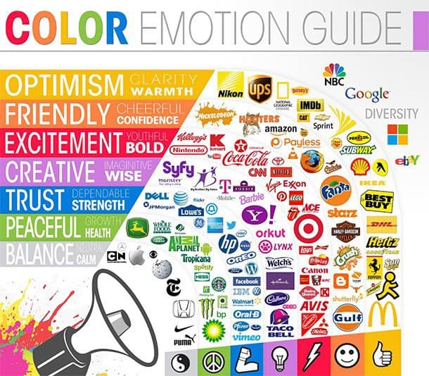
Humans are visual creatures. We can remember visual information much better than factual. For that reason, color schemes are an important part of making brands memorable. That goes, especially for the logo.
By now, this stuff is so ingrained, chances are that when you think of different companies and products, you automatically think of some color or color combination. Quick, think of Pepsi. Which colors came to your mind? Chances are you thought of red, blue and white within milliseconds.
The same mechanism is also the reason you can probably name most of the brands in the video below without seeing their actual brand name.
How did you do? Pretty well I bet. That’s branding done right. And the colors play major role in it. In fact, colors increase brand recognition by 80 percent.
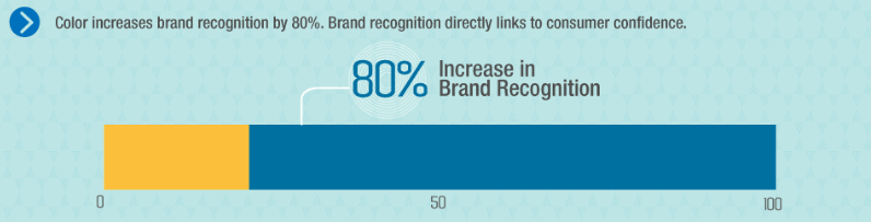
Recognition, in turn, builds familiarity, familiarity leads to trust and trust creates long-term customers. The good news: You can do the same with your own color scheme and turn your site into a brand of its own with all the benefits that come with that.
Colors Evoke Emotions
Yet, colors do more than make you easier to recognize. They can change how people perceive things. In fact, there is a whole scientific field that deals with how color affects human emotions, called color psychology.
Brands have recognized that and use it to their advantage. Many companies choose the colors they use in their marketing (including their website color schemes) according to what they want customers to associate with them.
Another excellent example of this is McDonald’s move to change the color of many of its restaurants in Europe from red to green in order to appear more environmentally conscious.
![]()
Works, doesn’t it?
Emotions Drive Decisions
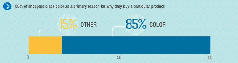
Colors influence human perception and emotions which gives them great impact on the decisions we make. After all – the majority of decisions are driven by emotions (even if we like to think of ourselves as purely reasonable). For that reason, it shouldn’t come as a surprise that 85 percent of shoppers state they purchase products depending on the color alone.
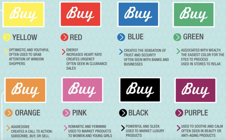
This extends to the digital realm. Colors are also able to determine conversion rates. For example, here’s how different colors of CTA buttons affect shoppers in North America:
In short – website color schemes make your site more recognizable, influence how visitors perceive your site and how they interact with it. Powerful stuff, isn’t it?
Now, are you convinced that finding the right color scheme is worth the time? Cool! Then let’s talk about how to create your own.
Factors to Consider When Picking Color Schemes
Contrary to popular belief, you don’t have to pick a color scheme from nothing by sheer stroke of genius. There are actually a number of factors that limit your color choices from the beginning.
That’s a good thing! Color options are almost endless. Finding a way to narrow your choices and point you in any sort of direction can actually be quite a relief. Here’s what to keep in mind when trying to decide on a website color scheme.
Your Key Demographic
Colors affect different demographics differently. For that reason, it’s important to know who you are trying to appeal to. Otherwise might do exactly the opposite just by choosing the wrong color scheme.
For example, if you have a yoga-related company, it’s important to use colors that appeal to people who might be into tranquility, nature and similar things. If, instead, you use the same colors as a law firm would, you will have a hard time converting them to customers.

That’s why market research is so important. It helps you understand your audience on a personal level. Their dreams and aspirations, what matters to them, their likes and dislikes and what they want to project to the outside world. All of it is important information for choosing colors that might appeal to them.
FYI, if you are not sure how to build an audience yet, check out our article on traffic generation.
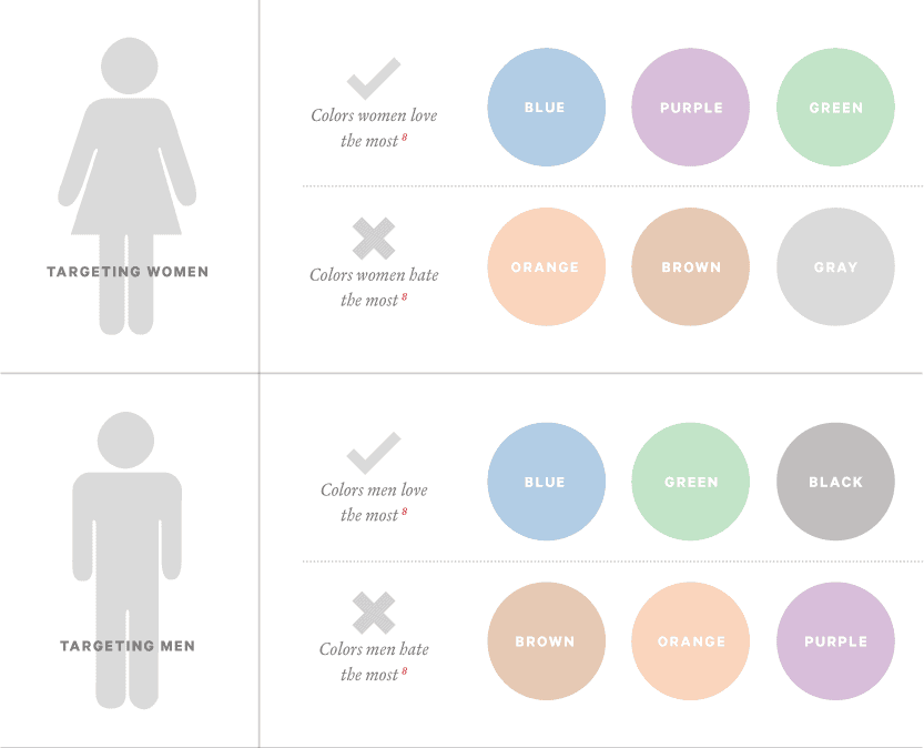
The Gender of Your Audience Members
Color is also something that different genders conceive differently. You can see this in the industry’s approach to “shrink it and pink it” when creating products for women, thinking that’s what they want.
These differences in perception are especially important to keep in mind if your website caters mostly to a specific gender. In that case, you need to make sure this is reflected in your color scheme.
However, which colors do the different genders prefer? Some research has been done in that direction.
You can find out even more details here.
From the above, you can see that pink is by no means the favorite color of the female population. While it is often associated with femininity, if you really want to appeal to women, you are better off using blue, purple or green. For that reason, gender is another factor to consider in your color scheme ideas.
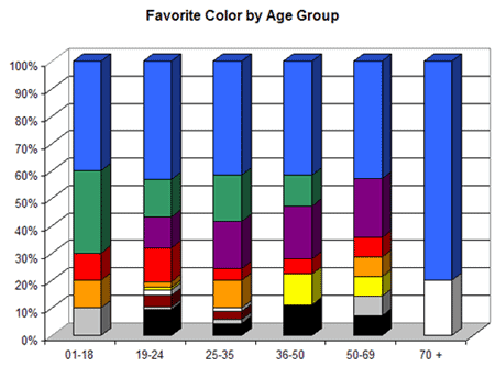
Your Audience’s Age
In addition to the above, a person’s color preferences might change with age. Therefore, if you predominantly cater to a specific age group, you need to keep that in mind. Here, too, we have some research at hand that should be food for thought when making your color choices.
The Industry You Operate in
Every industry has their own standards for how things are done. That includes color choices. In some professions, the same website color schemes are repeated over and over. For that reason, it’s a good idea to look to your competitors when trying to come up with your own.
Am I suggesting you should just do what everyone else does and emulate their color schemes? No, definitely not!
Looking at your competition will allow you to do several things:
For one, it lets you eliminate the exact colors they are using. After all – you don’t want to look the same as your closest competition. Branding, remember? Clients should be able to clearly distinguish between you and other parties.
Secondly, doing competitive analysis lets you understand common color themes in your industry. From here, you can either create something similar or at least go the opposite route to differentiate yourself. Either way, it gives you a direction and information to base your choices on.
In Short – Base Your Decisions on Facts!
Everyone has personal feelings when it comes to colors. It’s only natural to want to use what you like on your website. However, as you have seen above, this isn’t about you but about the people you are trying to appeal to. Your website color schemes should always serve your audience.
For that reason – it’s a much better idea to base your choices on solid data rather than your own taste. Anything else will likely cost you leads, conversions and money in the long run. On top of that – you now have enough information to make more informed decisions, so there really is no excuse!
6-Step Guide: How to Choose and Apply a Color Scheme to Your Site
With the above in mind, let’s now go through the process of how to choose a website color scheme. You will see that it has repeatable steps, you can do it several times if necessary.
1. Find Your Primary Color
The first thing you should do is to choose a primary color. That’s what your website and your brand will most be associated with. How do you pick one?
If you already have a logo (learn how to design one here) or an existing branding – you are in luck because you likely already have a primary color that belongs to it. In that case, you can base your choices on your existing material.
Yet, even if you start from scratch, the information above should at least have given you a general idea of which basic color would be a good option. If you still don’t know, take this quiz. It goes through much of what we have covered already and will give you a base color that you can start the process from.
Once you have decided on a basic color, you can further hone in on a specific shade by using the color search on either Dribbble or Designspiration (or both).
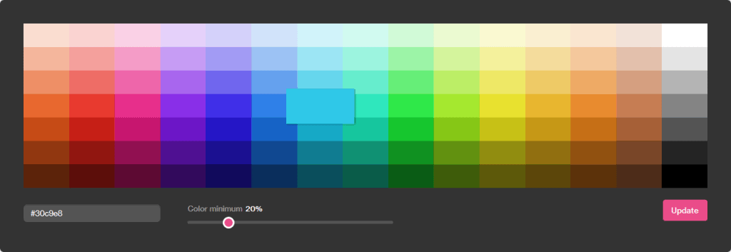
After doing so, both sites will show you examples of art work in that particular color (in combination with other hues). When you find something that you like, use a tool like ColorZilla to grab any color’s HEX code from the right side of the browser.
All done? Then let’s move on.
2. Decide How Many Colors to Pick
After you have picked a primary color for your scheme, it’s time to decide how many others you will use. While the final choice depends on your website, there are some general guidelines you can use.
For example, you could follow the 60-30-10 rule, which originally comes from interior design. In that case, you use three colors – a primary, secondary and an accent color. The primary color takes up 60 percent of the space, the next 30 percent and the last 10 percent.
In overall, it’s a good idea to stick with three, maximum four main colors. Anything beyond that easily makes your site too chaotic and overloaded.
Additionally, you also have to keep in mind that you will need extra, more neutral colors for things such as fonts and backgrounds. Those are in addition to your main and accent colors. White and gray are very common choices but it’s also possible to use different shades of your primary colors.
More on that below.
3. Choose Your Secondary Colors
After giving a thought on the number of colors, it’s time to actually choose them. Doing so is a scary thing, especially if you are not a designer and don’t know much about color theory.
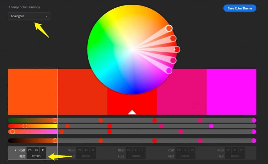
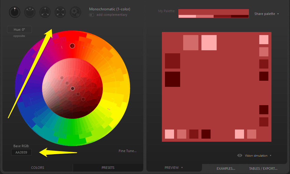
The good news is – you don’t need to! You can just let some online tools do the heavy lifting for you. A good first start is the Adobe color wheel.
It helps you find either the colors that are similar (meaning close to each other on the color wheel) or less similar (far away or opposite from one another). Just enter your primary color’s hex code in the middle and use the drop-down menu in the upper left corner to have the tool create fitting colors for you.
An alternative to the color wheel is Paletton. You can add your base code, then use the tools at the top to create complementary colors for your palette.
You will find more tools like this at the bottom of this article. At this moment, these two should be enough to accomplish your task.
(By the way, you can find more web design software in this article.)
4. Find Your Neutral Colors
We have already mentioned them further above. They are used for text, to differentiate elements from white space or as background colors.
These shades will contribute to the overall mood of your site and have great influence on legibility. They should work well with your dominant colors and, at the same time, not distract too much.
Good choices are one dark and one light neutral color (usually grays). They can also be shades of your dominant colors or if you feel adventurous – something completely different.
Use the aforementioned Dribble or Designspiration to find fitting neutral colors for your chosen primary color in the existing material. If you have Photoshop, you can also use the technique below to create harmonious neutral colors.
That’s it! Once you have picked both primary, secondary and neutral colors, your website color scheme is good to go. Now, all that’s left is apply it to your site.
5. How to Apply Website Color Schemes
After you have chosen a color scheme, how do you apply it to your website? Where do the different colors belong?
Here are some pointers:
- Primary color — Put it where you want to direct the attention of your visitors or want them to take some actions. That means CTA buttons, logos, icons and important information such as contact details and headlines. Alternatively, you can use your primary color for backgrounds and the accent colors to really make things stand out.
- Secondary color — The secondary colors are used to highlight less important information on your site. Think secondary buttons, active menu items, subheadings or backgrounds. Unless, of course, you use your primary color in larger areas and want to create more contrast with your accent colors.
- Neutral colors — You will typically use neutral dark colors for text and white or light colors for backgrounds.
6. Go Through the Process Several Times
When you have arrived at your color scheme, don’t think that that’s what you need to settle for. In fact, – it’s probably a better idea to give yourself a couple of options. It lets you understand better what does and does not work for you.
Therefore, I recommend that you go through the process above a few times to find several website color schemes for yourself. This makes it more likely you will find one you will absolutely love.
Helpful Tools to Create Color Scheme Ideas
Besides the tools mentioned so far, there are also a number of other tools that make creating website color schemes a lot easier.
- TinyEye Labs — This site can create a hex color palette from an image. Simply screenshot any website you like, upload the screenshot and see what colors they are using. An alternative is Canva Color Palette Generator.
- ColorExplorer — A nice online service to create color palettes. Pick colors or import them from images, HTML/CSS or a web address. Add them to a collection, find matching colors and a lot more. Highly recommended!
- Colorspire — Similarly to Paletton and Adobe Color this site lets you build website color schemes with a simple interface.
- COLOURlovers — Online community where designers show their color palettes. If you don’t how to choose color combinations for a website, you will find plenty of inspiration from this site.
- WCAG – Contrast Checker — Checking the contrast of your color schemes is not only important for legibility but also to pass accessibility standards. That means that even people with visual impairment are able to read your content. This website makes it easy to check your color combination for this. You can also use this alternative.
More tools, including for desktop computers and mobile devices are listed here.
11 Inspiring Color Scheme Ideas from Around the Web
Still here? We are almost done! To round off this article, we will now go over a number of website color schemes from the existing sites. That way, you can look at how other people are using color and find inspiration for your own site.
1. Mathemagiker

A very lively first example. Orange and blue are the main colors and more subtle tones create a balance. In addition to the color scheme, the site’s appeal comes from its structure and design.
2. La Pierre Quit Tourne
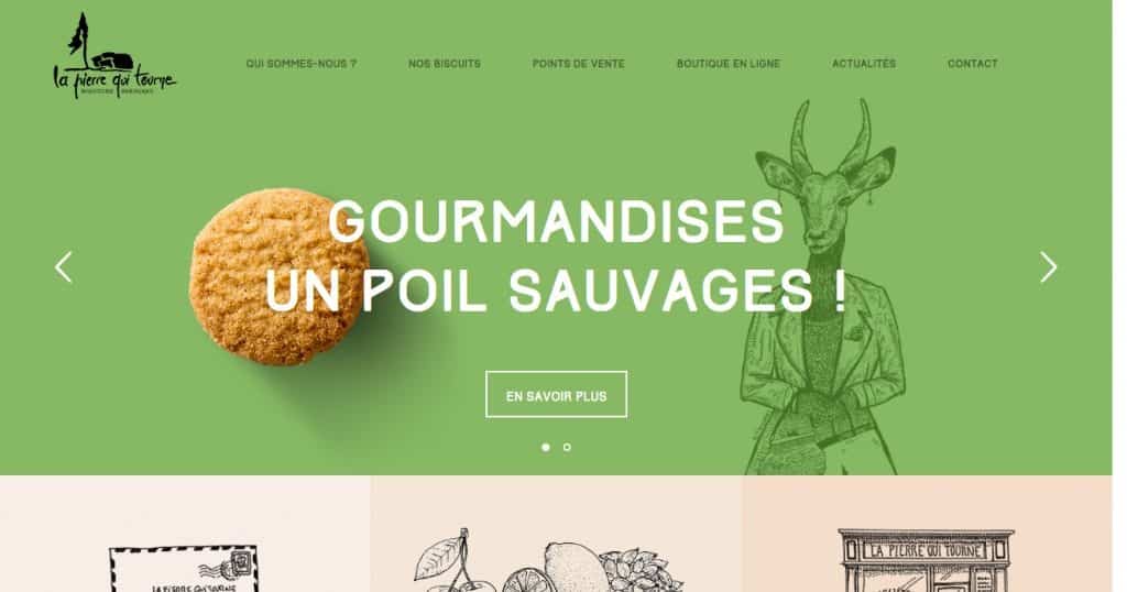
Don’t let the screenshot fool you, the site actually has quite a wide color palette that changes with the slider. It comes in brown, blue, green, purple, orange and everything else. Yet, the colors fit together well and the static elements in neutral tones work with all variations.
3. El Burro

Energetic, exciting and bold colors. The pink alone is pretty daring but harmonizes with the hues in the photo. When you scroll further down, the background color changes constantly, revealing the rest of the color palette. It makes you hungry just looking at it.
4. A Short Journey

The color palette in cyan, blue and orange reminds you of a sunny summer day. Just looking at them, you get in the mood to head for the beach. Or maybe that’s just me.
5. Lo-Flo Records
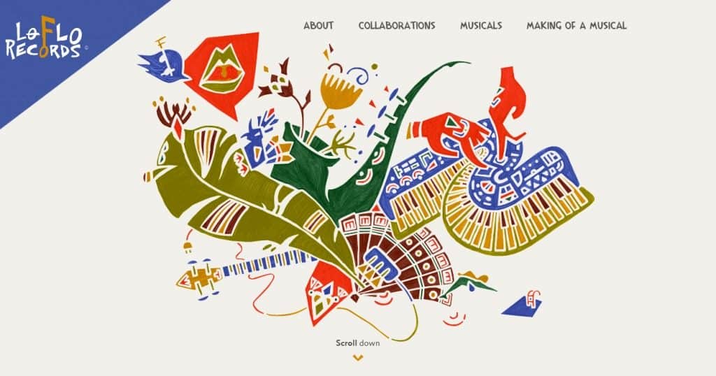
A color explosion in gold, dark blue and off white that conveys playfulness and joy.
6. Sirin Labs

Black, gold, white and subtle green all scream luxury. Using the colors sparingly gives the site a sleek, chic look and conveys high value.
7. Assiko
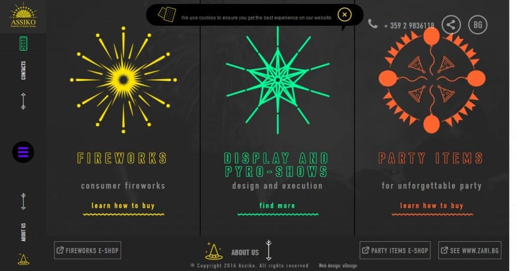
Explosive color choices full of energy on this site. No wonder – they are selling fireworks! Click through to the site to see the favicon and animations. They only underline what the colors promise.
8. Serio Verify

Clean yet expressive. They really went with the phrase “dominant color” to create this simple but effective website design. The scrolling effects are also worth checking out.
9. Pharrell Williams

Playful and full of colors like purple, yellow and teal. Lots of white space avoids visual overload. Underlines the importance of using neutral tones to balance out stronger hues.
10. reputationsquad

Another dark example with a great accent color choice.
11. Spotify

Spotify has quite a reputation when it comes to colors. While this example is very pink, you also have blue and purple parts of the site.
Wrapping Up
Choosing your website color schemes can be difficult when it comes to building your own website. Unless you are a designer, there’s a good chance you don’t even know where to start.
Color schemes are a central part of branding and visitor appeal, they drive conversions and simply make your site look professional (or not). Yet, you don’t have to be an artist or hire a professional to create them.
If you understand the psychology behind colors, have a basic understanding of color theory and know the right tools, you, too, can come up with professional and unique website color schemes in no time.
By now you should be able to create your own website color scheme. I, for once, can’t wait to see what you have come up with!
Do you have any other tips or tools to create website color schemes? Please don’t hesitate to let us know in the comments section below!
The post How to Create Website Color Schemes in 6 Easy Steps (+Examples) appeared first on websitesetup.org.